
Understanding the Problem
Some Context
Prior UX research on the legacy site highlighted usability issues with the homepage and search. I led alignment workshops with the team to prioritize usability issues we can address within our 4 month time frame and translated the issues into user-centered design goals.
What we Learned
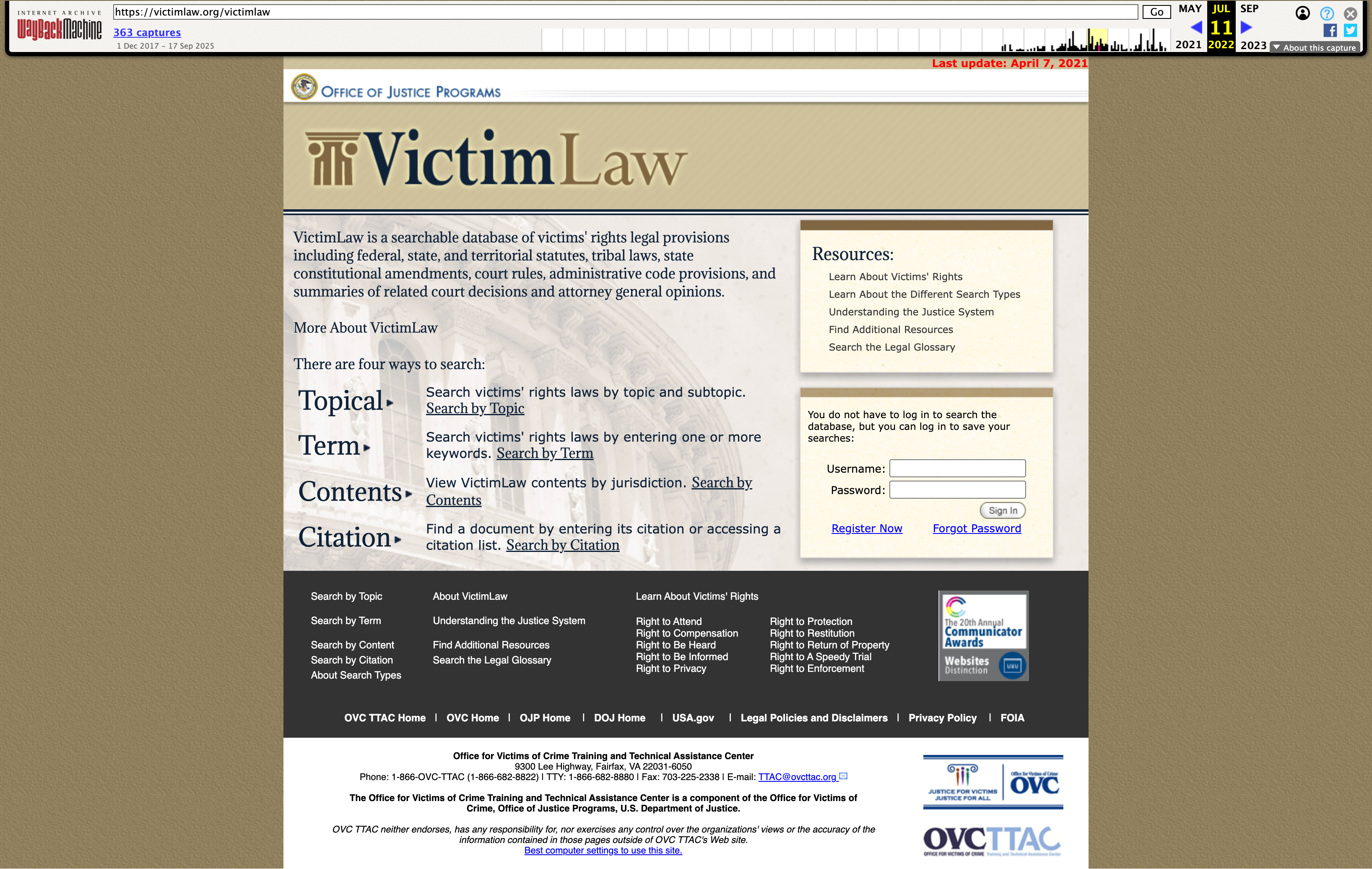
Lawyers and advocates faced an outdated homepage and dense layout
→
Slowed scanning and delayed access to resources
→
Required extra clicks before reaching relevant content
→
Wasted time during case prep and reduced efficiency
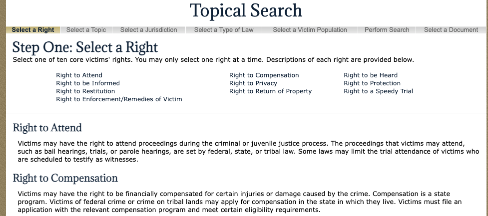
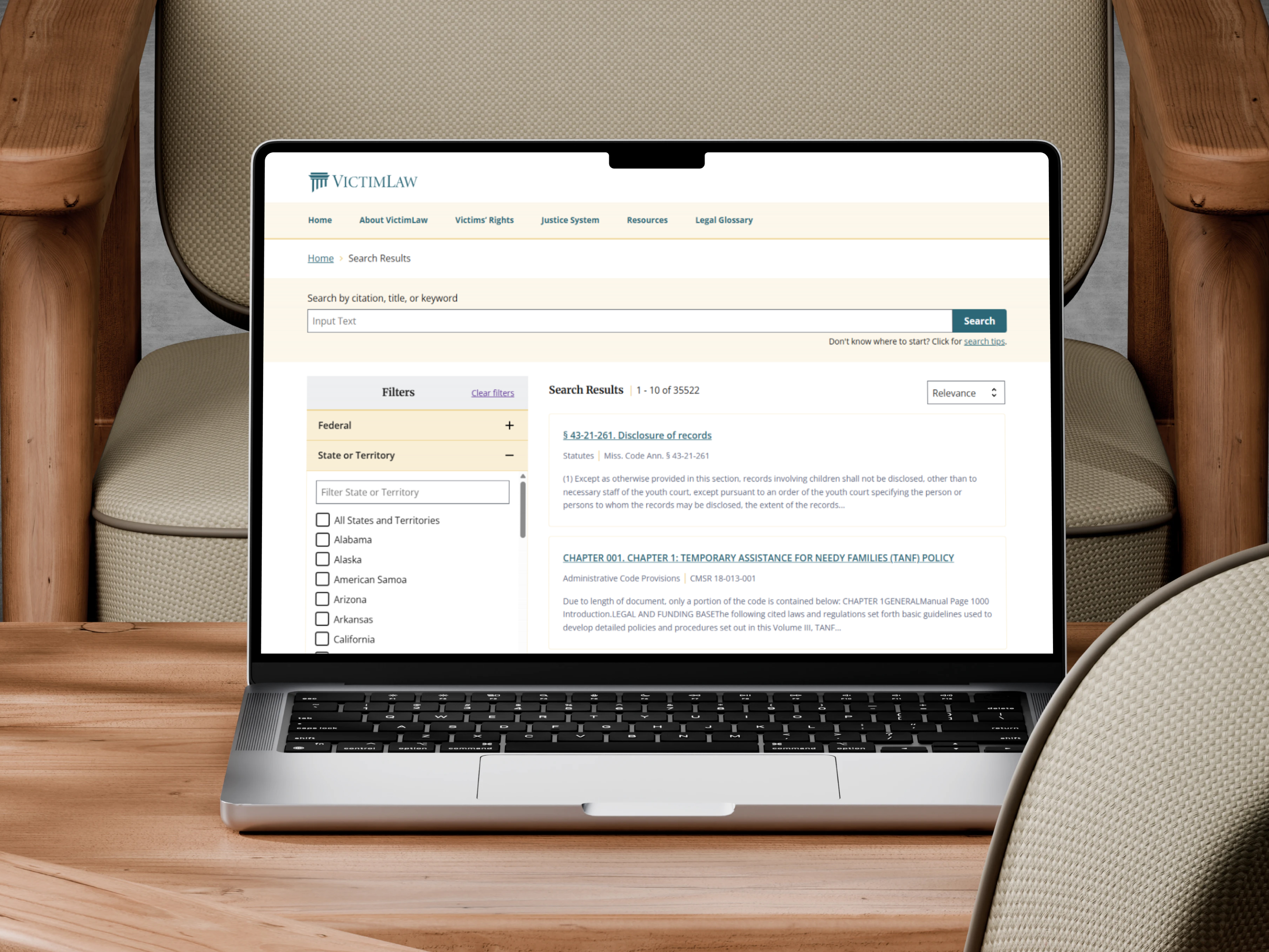
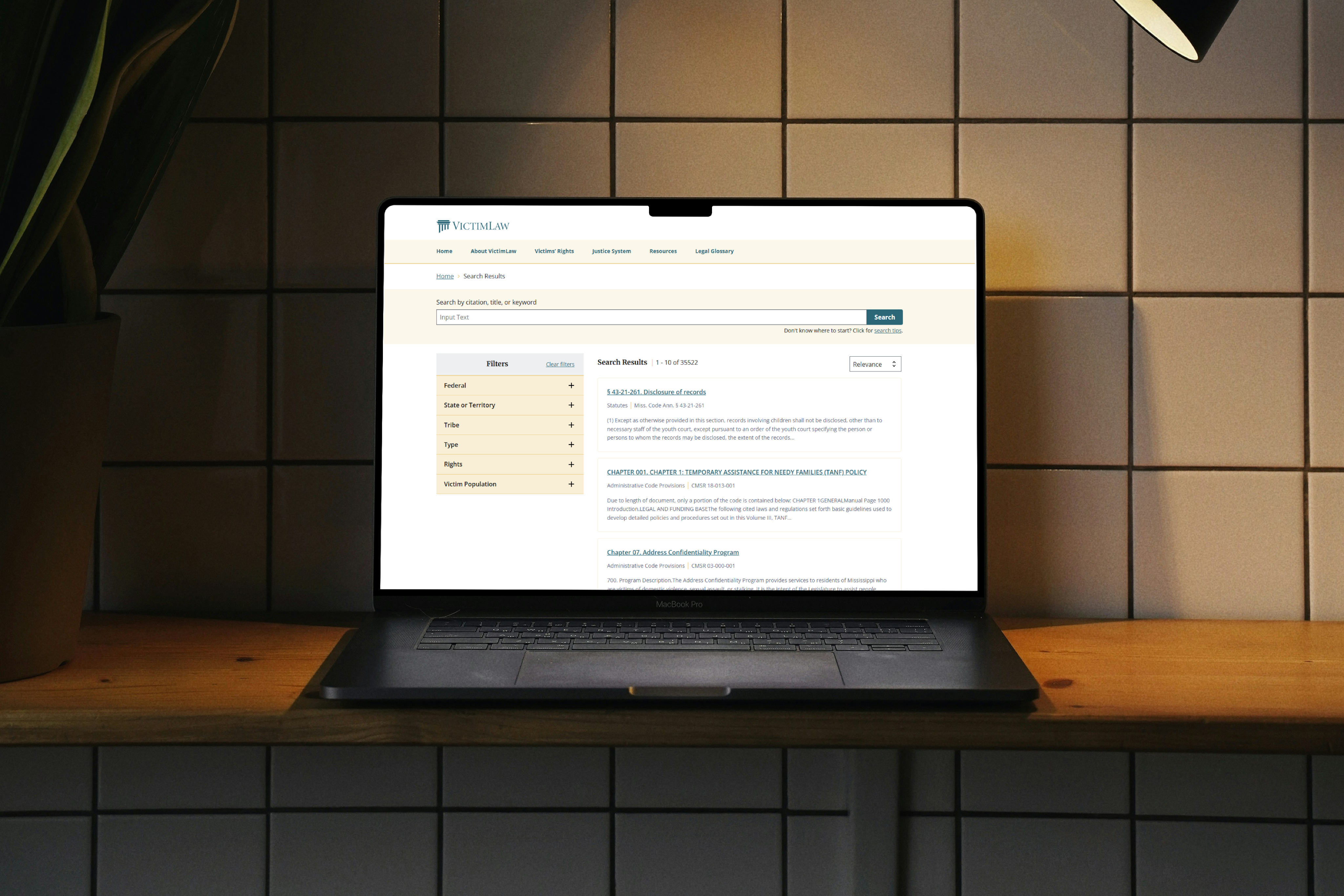
Search experience was step-based and overly complex
→
Forced into rigid steps instead of modern keyword-first search
→
Added cognitive load and broke natural search patterns
→
Especially difficult for new users trying to refine queries
New lawyers and general users encountered the same friction
→
Non-experts struggled with confusing flows
→
Reduced confidence and trust in the platform
→
Undermined mission to make legal guidance broadly accessible
Competitibe Analysis
Using LexisNexis as our north star
LexisNexis is a popular legal research tool that provides their users easy search functionalities but is gated by a pay wall. Our SME has access to the tool so they were able to provide a demo and some key design aspects that we should consider in the redesign.
→
Use collapsible facets/accordions to reduce clutter
→
Lexis provides pre-filters for faster searching
→
Mobile Responsive

The Goal
Redesign VictimLaw.org to deliver a WCAG-compliant, USWDS-based experience with a modern homepage and simplified navigation
1.
Setup the Design System
2.
Replace rigid step-based flows with intuitive, keyword-first search that supports both experts and new users
3.
Use collapsible filters, smart pre-filters, and responsive layouts to guide users efficiently
4.
Redesign the layout to make scanning faster, cut extra clicks, and save time
5.
Apply the Design System to wireframes
6.
Quality Assurance testing with developers to ensure the text, spacing, color, and experience remained consistent across the site